I began looking up the word Antiqua to ensure I had spelled it correctly. My spelling is not good (I respond to words more phonetically than literally). Anyway here’s what I discovered by chance:
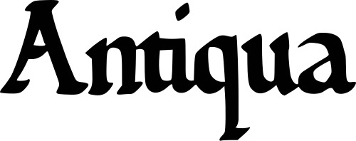
Antiqua is a style of typeface used to mimic styles of handwriting or calligraphy common during the 15th and 16th centuries. Letters are designed to flow, and strokes connect together in a continuous fashion; in this way it is often contrasted with Fraktur-style typefaces where the individual strokes are broken apart. The two typefaces were used alongside each other in the Germanophone world, with the Antiqua–Fraktur dispute often dividing along ideological or political lines. After the mid-20th century, Fraktur fell out of favor and Antiqua-based typefaces became the official standard in Germany. (In German, the term “Antiqua” refers to serif typefaces (a slight projection finishing off a stroke of a letter in certain typefaces; compare with sans serif).
Anything affecting writing is of interest to me (calligraphy, parchment paper, ink and ink bottles, embossers and sealing wax, pens and fountain pens, typewriters, computers and iPhones). I had not however imagined that politics and ideology figured prominently in the world of calligraphy. Once again it appears that the daily events of our lives repeat the past in unexpected ways.
Paul Friedrich August Renner (9 August 1878 – 25 April 1956) was a German typeface designer, author, and founder of the Master School for Germany’s Printers in Munich. In 1927, he designed the Futura typeface, which became one of the most successful and most-used types of the 20th century.

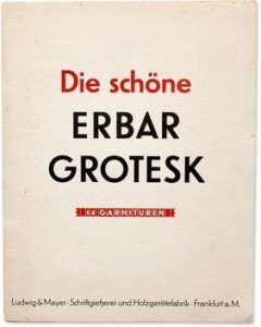
Futura is a geometric sans-serif typeface designed by Paul Renner and released in 1927. Designed as a contribution on the New Frankfurt-project, it is based on geometric shapes, especially the circle, similar in spirit to the Bauhaus design style of the period. It was developed as a typeface by Bauersche Gießerei, in competition with Ludwig & Mayer’s seminal Erbar typeface.
Even before 1932, Renner made his opposition to the Nazis very clear, notably in his book “Kulturbolschewismus?” (Cultural Bolshevism?). He was unable to find a German publisher, so it was published by his Swiss friend Eugen Rentsch. While designing his typeface Futura, Renner appeared at a public forum in Munich with several other German authors to speak out against the Nazis and other right-leaning parties who criticized anything that deviated from tradition as being “cultural bolshevism.”[1]
After the Nazis seized power in March 1933, Renner was arrested and dismissed from his post in Munich in 1933, and subsequently emigrated to Switzerland. Soon after the book’s publication, it was withdrawn from the German book market, until a photo-mechanical reprint was issued by Stroemfeld Verlag, Frankfurt am Main/Basel, in 2003. The new edition included comments by Roland Reuss and Peter Staengle (a main source for these notes).